#designedbyramz

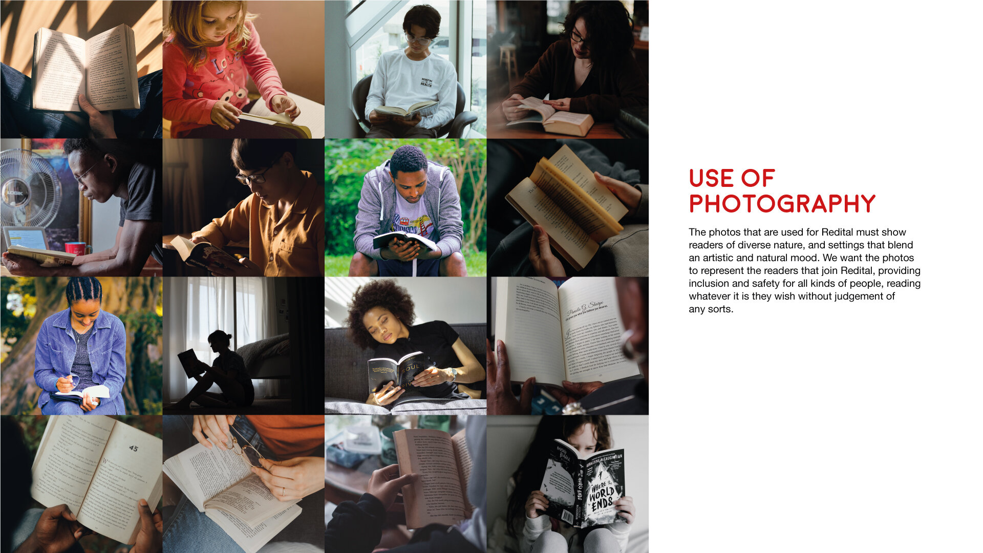
Redital was a client project. The ambition and goal of Redital was to be an online book-club and generally a haven for book readers to find reviews, share discussions and build a reading community. This would also eventually lead on to being a curated subscription service, which each month subscribers would receive a gift box with a book of the month to read, and multiple extra supplies plus gifts relating to reading.
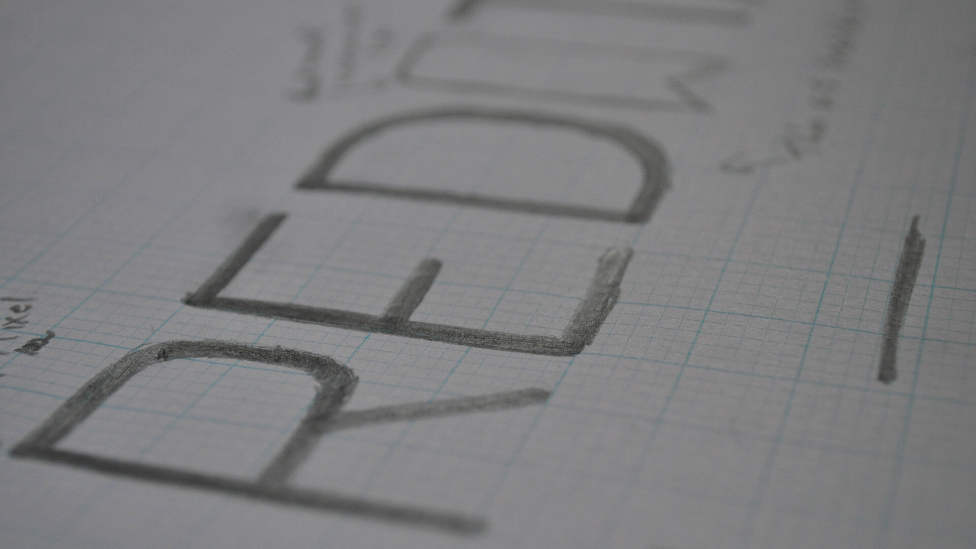
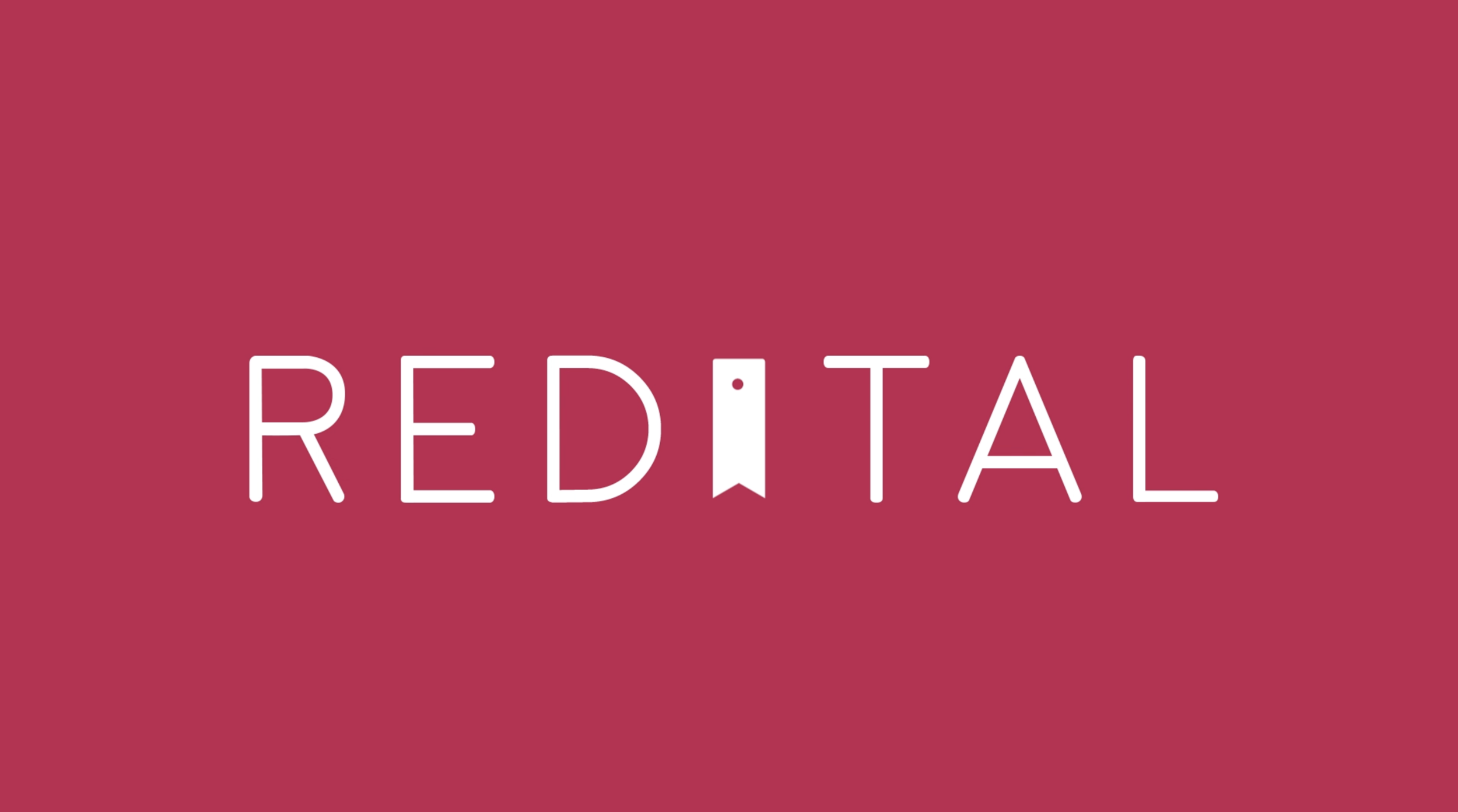
Designing the logo, I had in mind to have the balance of keeping it professional and basic, whilst adding subtle elements that allowed it to be approachable and have that calm vibe to it. drawing out the words on graph paper, rounding out the edges of each letter and replacing the letter “I” with a bookmark - playing also centre-point of the logo - allowed a nice final outcome that could work as experimentation with animating, placement on products and developing icon designs as well.
This has gone through a fair few updates since, but now with a style guide in place there is a process that works for the brand to be more approachable.
This includes my sketch of the logo as well as concept ideas of the Redital Book Club packaging. This also includes the animation which you can also find on my Logo’s page here.
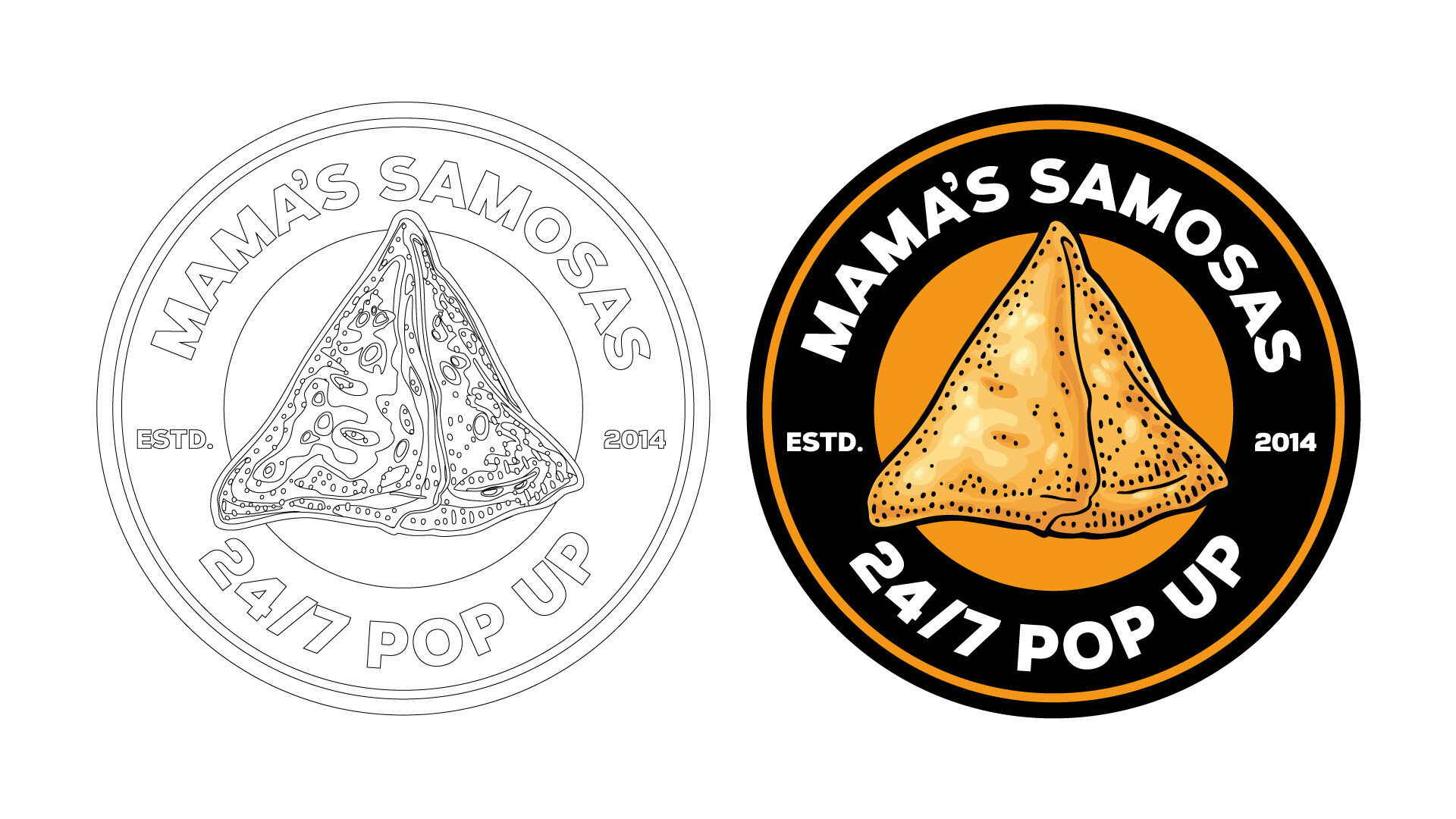
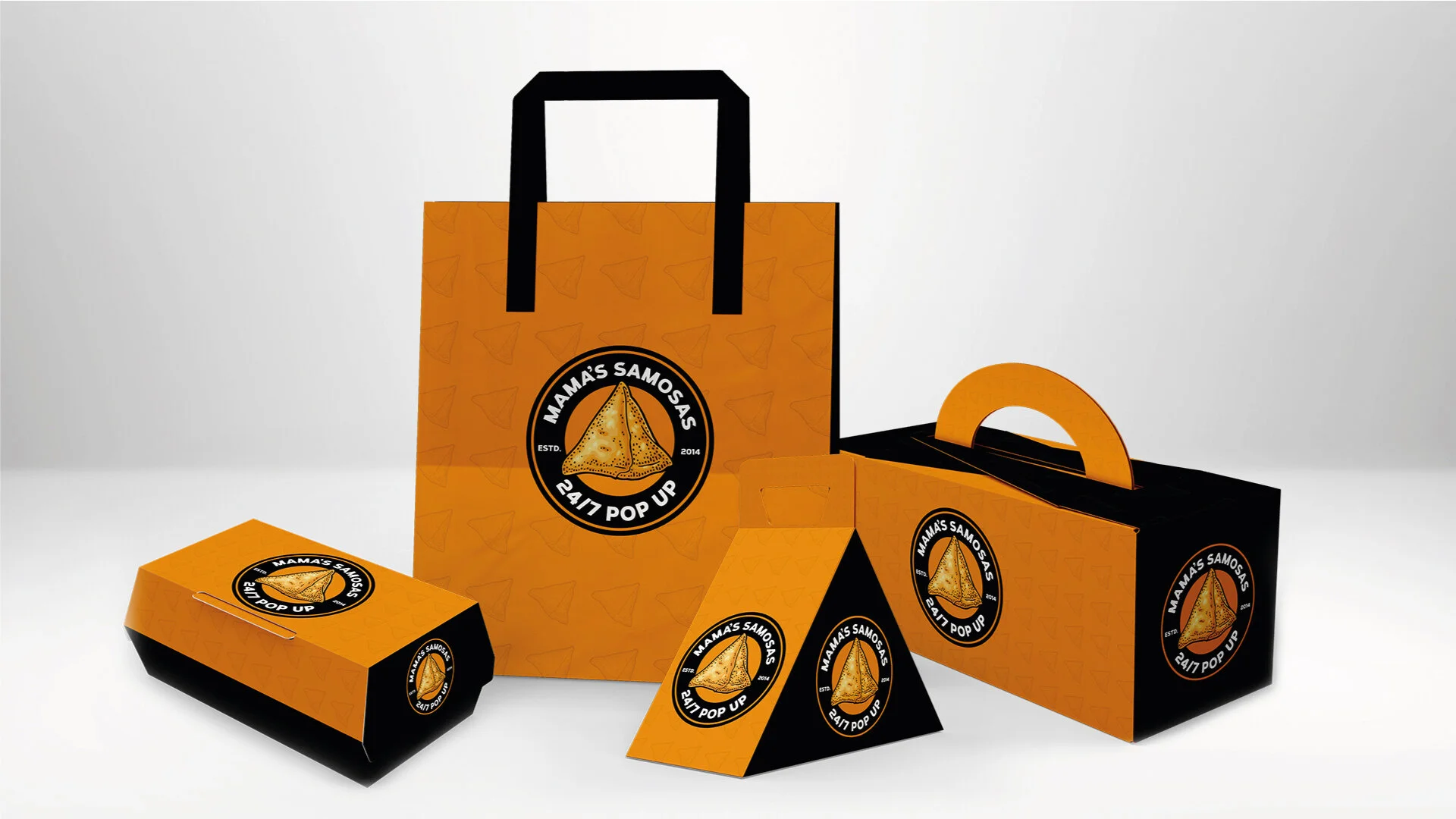
Mama’s Samosas is a personal project which delved into the street food market. It was designed as a family business using the South Indian snack as the star dish for a street food business.
I designed the logo originally as just a wording design, quickly stacking on my list of logo designs. later down the months I thought about applying the business in a “what if this was reality” mindset and revisited the design, taking inspiration mostly of American street food stalls and trucks, their approach of taking a simple dish and marketing that towards the public audience. Looking also at the design methods these street food vendors take, I wanted something bold and more striking than just words.
With the new design in place, I wanted to create a style guide, mostly for practice sake. This helped give the logo design more of a personality and a branding process which I’m proud of someday making a reality.
Includes my sketch to final process, looking at different variations I had in mind, and a few packaging designs.
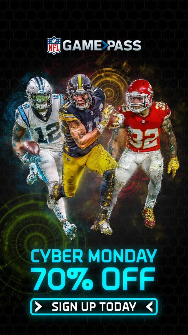
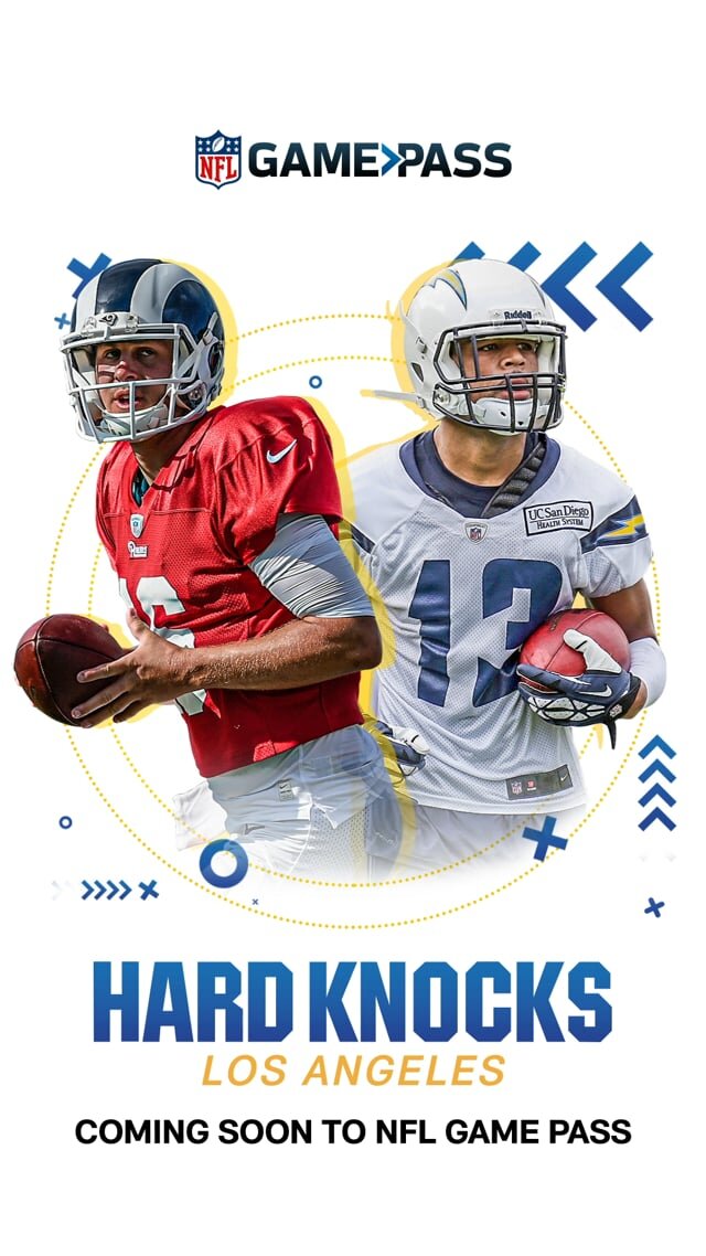
My time at Two Circles Agency has led me to work closely on NFL Game Pass work. On a more senior level the work balanced between designing and managing creative outputs for multiple projects. Creatives you see here were designed throughout the 2020/2021 season of NFL, for digital, print and motion. This includes:
Acquisition, Win Back & Ladder Up emails
Designing for campaigns such as Cyber Monday, Thanksgiving, Hard Knocks, El Buen Fin
Centrepiece designs (website front image)
Multiple artboard projects for banners
Blueconic designs
more to update…
During my time at Two Circles, the sports data-driven industry, I worked mainly on creating assets, designs & animations related to NFL. Sunday In 60 is an NFL Original on the NFL Game Pass streaming service/app that provides key highlights and moments of NFL Sunday games in 60 minutes.
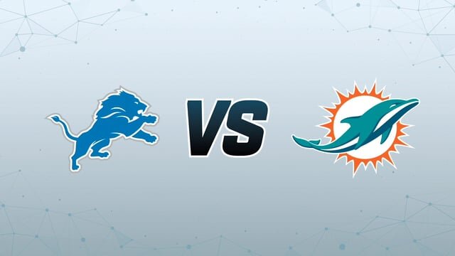
I had the opportunity to create the logo, opening title and transition matchups for this show. As this was to be kept simple and within boundaries of the NFL branding, the main objective was getting the wording style right, and able for animation purpose.
Having then already made the Game Pass animation as well as the different team logo animations, the storyboard of this intro was to make sure it was a somewhat straight to the point build to the match highlights, taking at least 15-20 seconds to lead up, and having every 5 minutes after a transition playing to the next match.
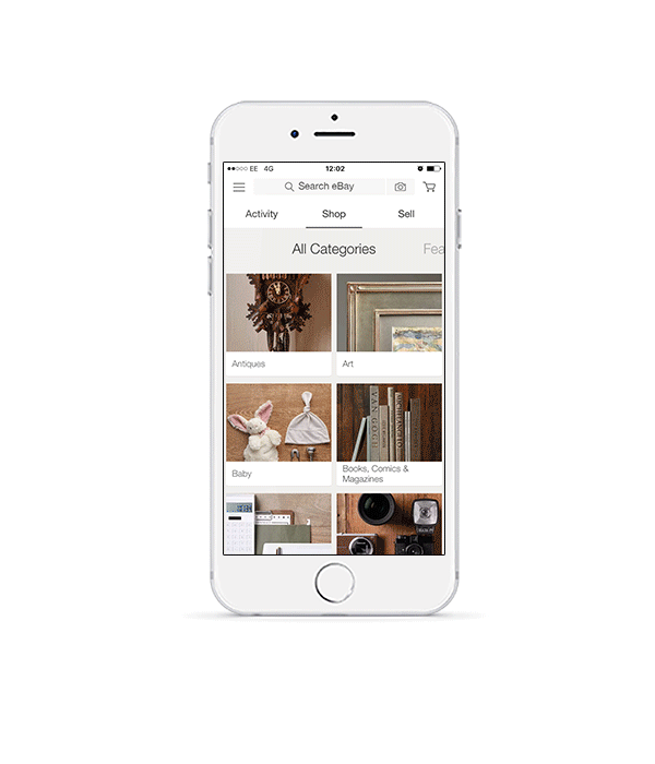
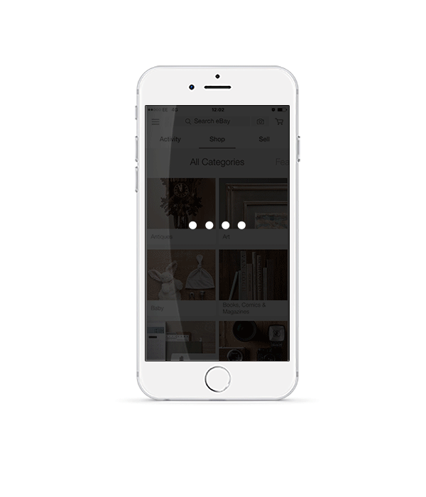
eBay SNAPS was a project a created during my time at FEED Agency. During the time when AR/VR was becoming more prominent amongst retail & e-commerce marketplaces, I curated an idea for eBay to essentially ‘jump on the bandwagon.’
Adding a ‘search by camera’ function to the app, eBay would allow users to find the product they are searching for exactly (or close to) by taking a snap on their phone.
While the technology was not exactly new even during the time of augmented reality booming, the fact eBay had no real interaction with audiences through their app at the time puzzled me. Applying this method was an idea of integrating audiences to feel a little more closer in searching and buying through the app and keep them coming back to eBay.
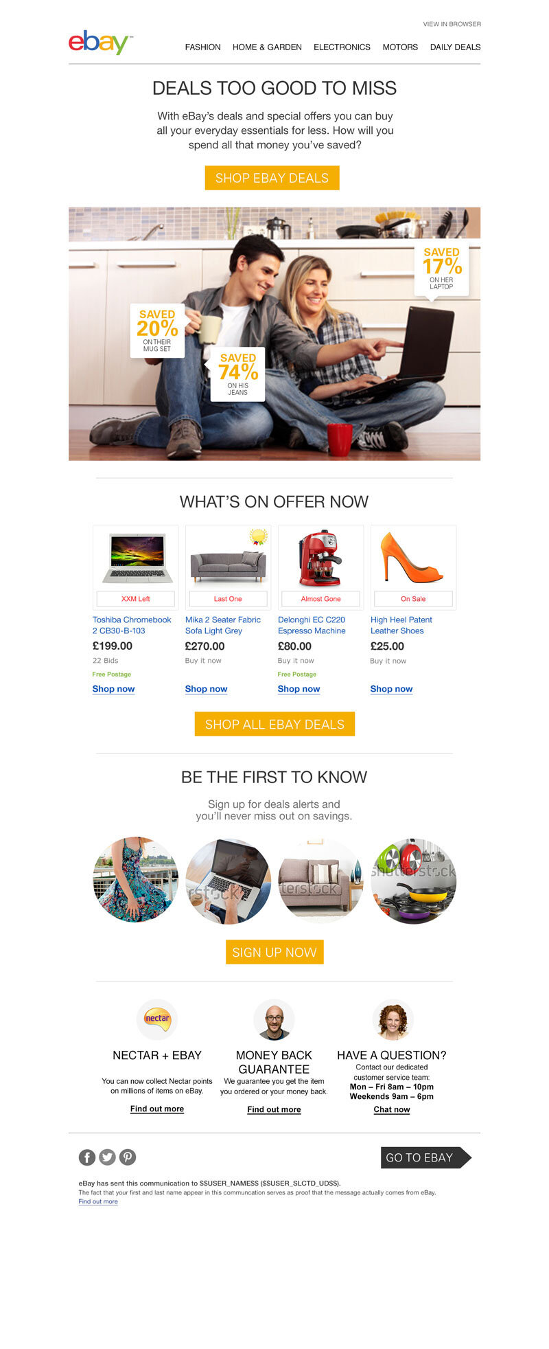
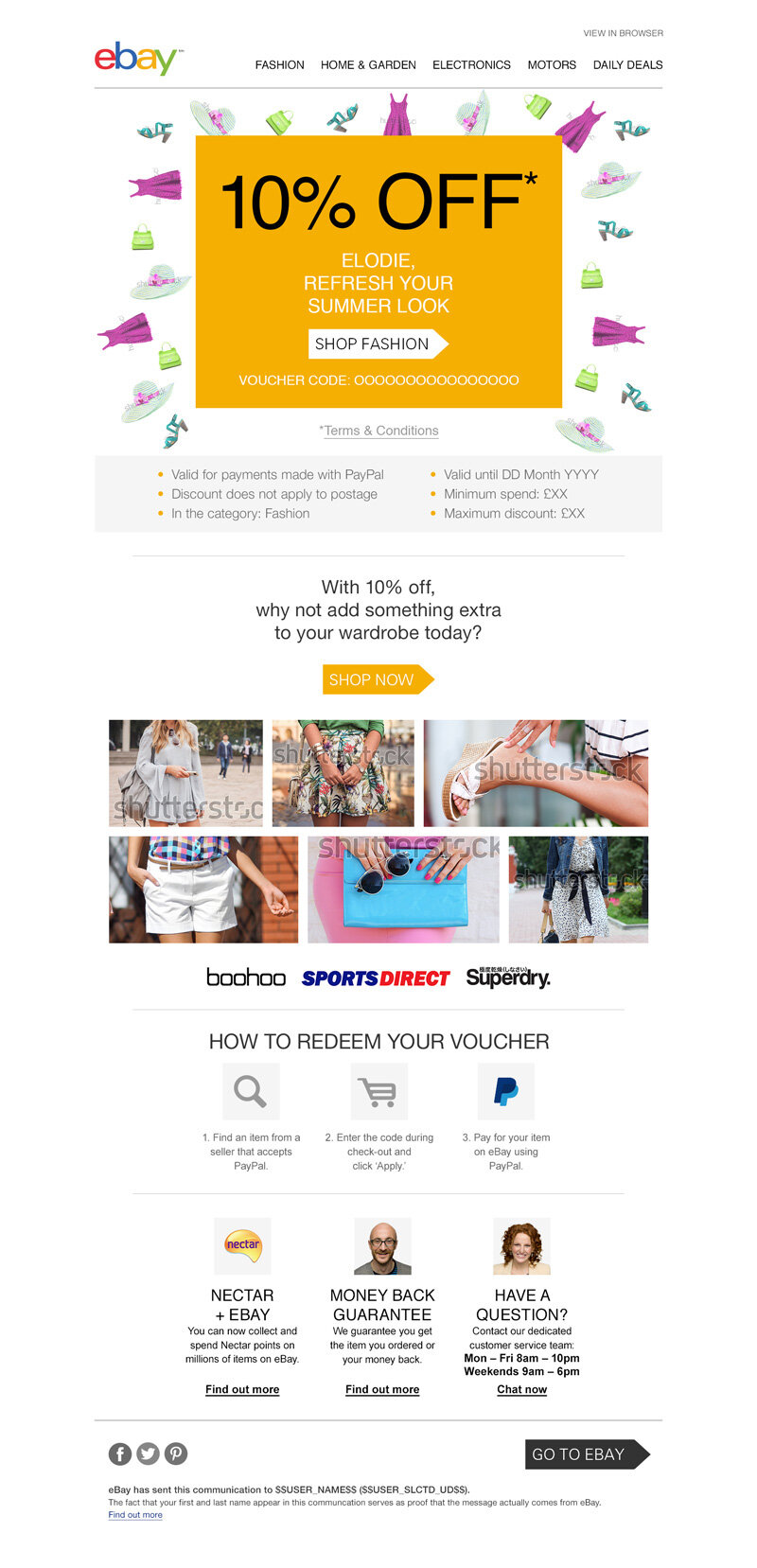
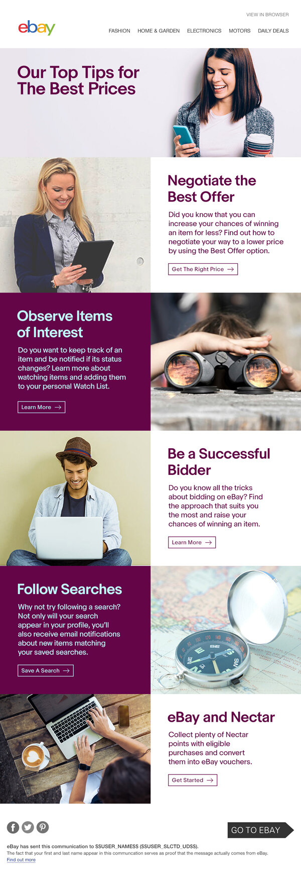
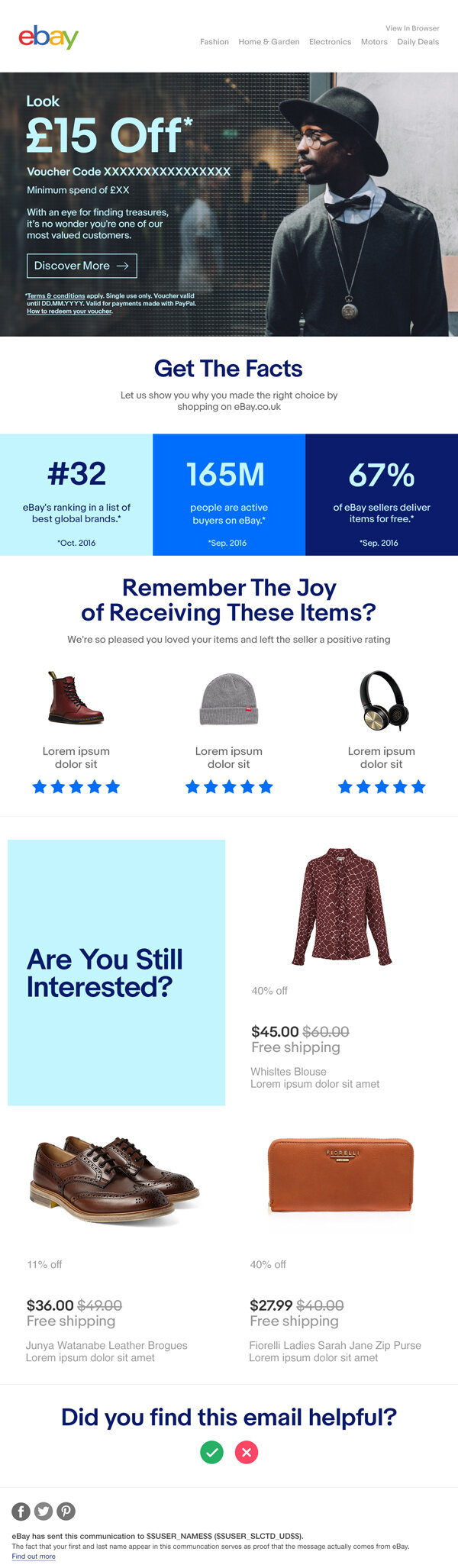
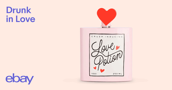
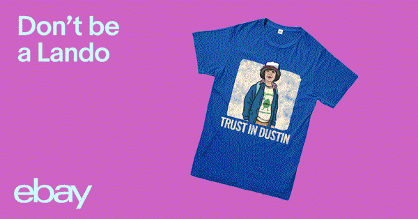
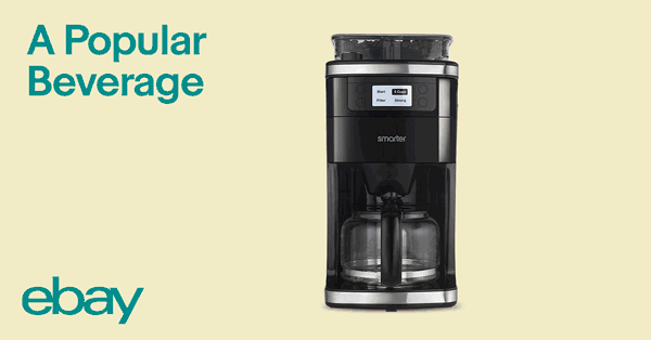
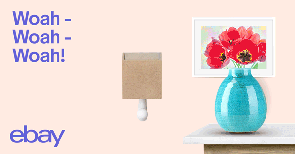
During my time at digital design agency FEED, my main work involved designing creatives for eBay. This would bounce around from designing emails, banners, app design, web, social and more. the collection on this page are of the following:
CRM Emails: Added at the time to the CRM team, the main goal was to create emails that gradually brought audiences to click and view. Along with this we were eventually adapting the designs to the new brand guidelines introduced, allowing responsive builds and potential interactive designs that would include GIF animations.
Secret Santa: These designs and process were for the eBay app allowing users to create a group and list for Secret Santa objectives during Christmas time. The idea was to allow the user to create a group alongside friends and/or family also using the app, to then go through the traditional process of what Secret Santa entails. This would allow the group to possibly share their wishlist in the group, with the eBay app helping to find products similar and/or at best prices available.
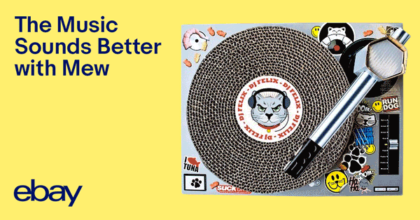
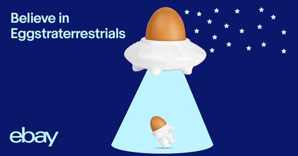
Social Product Ads: Being added to the Social Team, the objective here was to promote an item each week via eBay’s social media platforms (Facebook, Twitter, Instagram). My aim for each product we were given was to have a bit more fun in making more motion designs, setting a certain aim in terms of timing, client satisfaction and storyboarding.